Miropoix
SaaS app landing page redesign
- Role
- UX/UI designer / Design Engineer
- Type
- Client project
- Tools



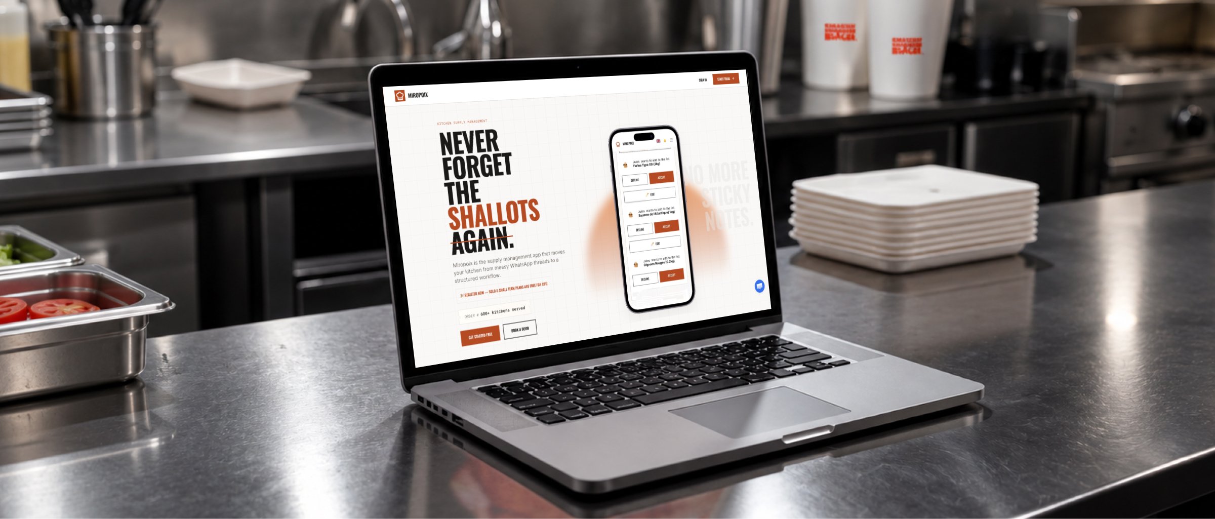
Miropoix is an app for hospitality teams that helps kitchen staff collect product requests and organise them by supplier. I designed a new product website, refreshed selected app screens for presentation materials and built the site with the help of AI tools.
- Problem
- The app solved a real kitchen ordering problem, but its generic appearance lacked a recognisable brand identity.
- Goal
- Refresh the UI, design a landing page and give the product a distinctive visual direction rooted in the hospitality industry.
- Outcome
- New app screens, animations, a landing page and a live website for Miropoix.
Starting point
The project was based on an existing product, a supplied wireframe and website copy. My role was to give these materials a visual form, create assets presenting the app and turn the design into a working website.
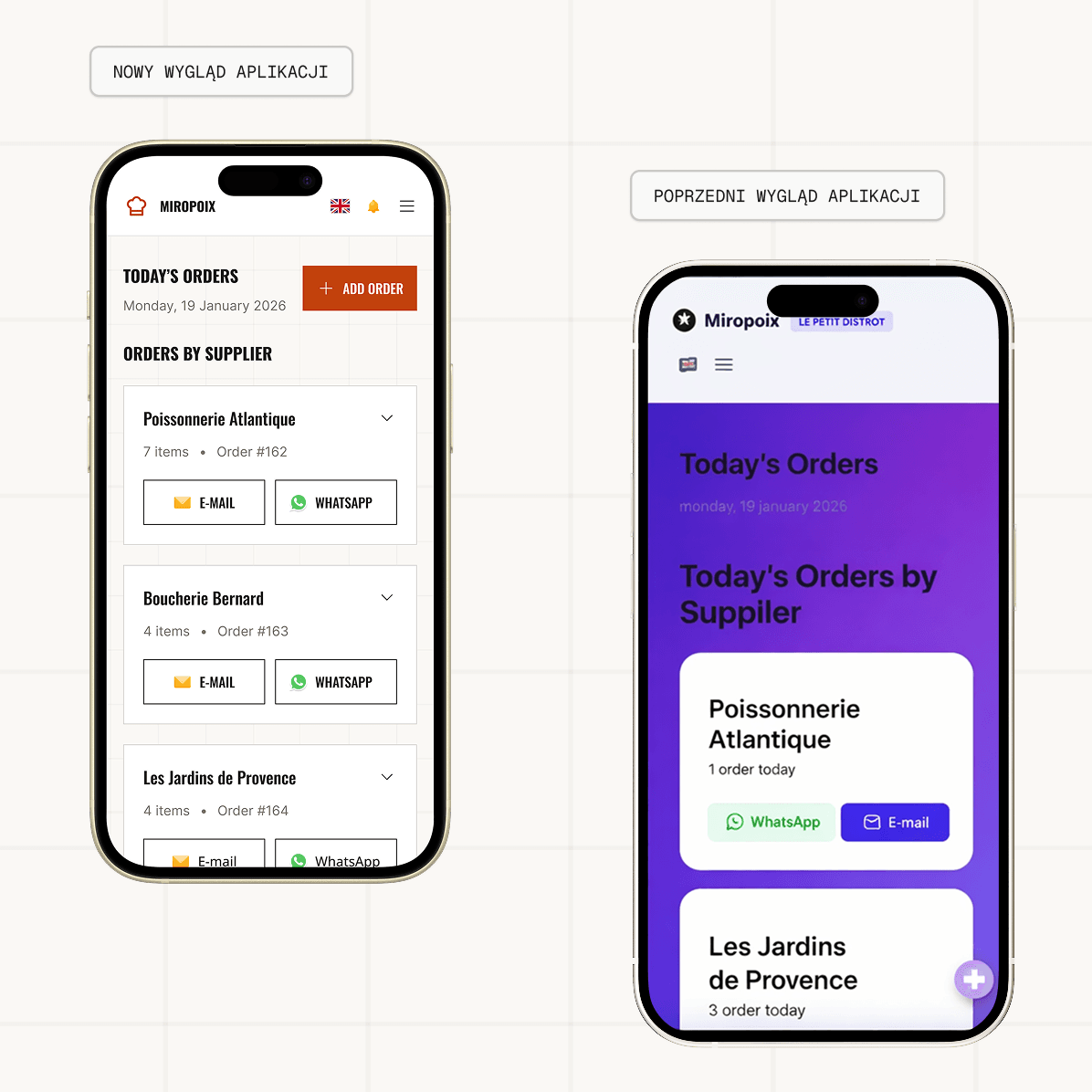
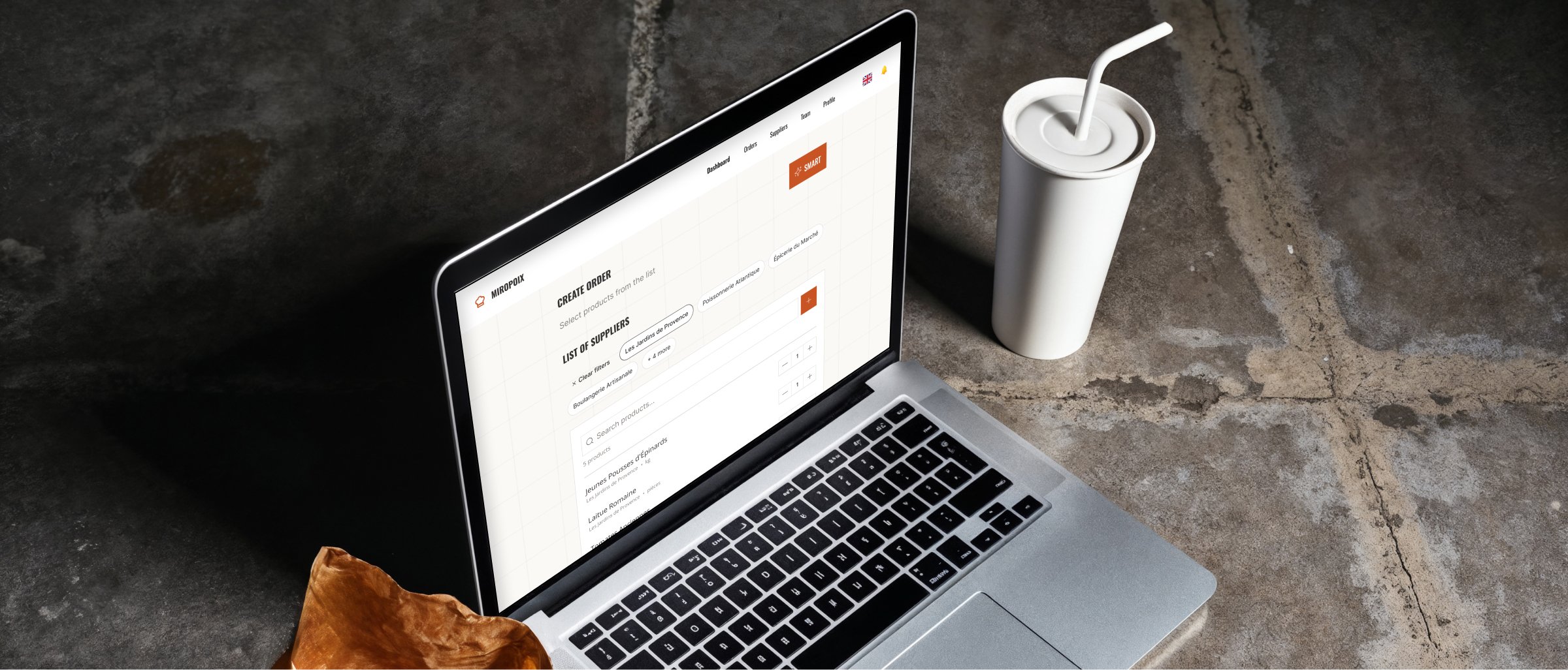
I also refreshed selected app screens to showcase the product on the website. These changes were made for presentation materials and did not involve redesigning the whole app.
Process
I began by learning how the product worked and organising its presentation around the supplied materials. I then developed the website's visual direction and app screens illustrating the key actions.
From there, I created product animations and moved on to building the website. Combining design and development let me refine how elements behave and how content is presented in the browser.
The video could not be played. Open MP4 file
The video could not be played. Open MP4 file
Design decisions
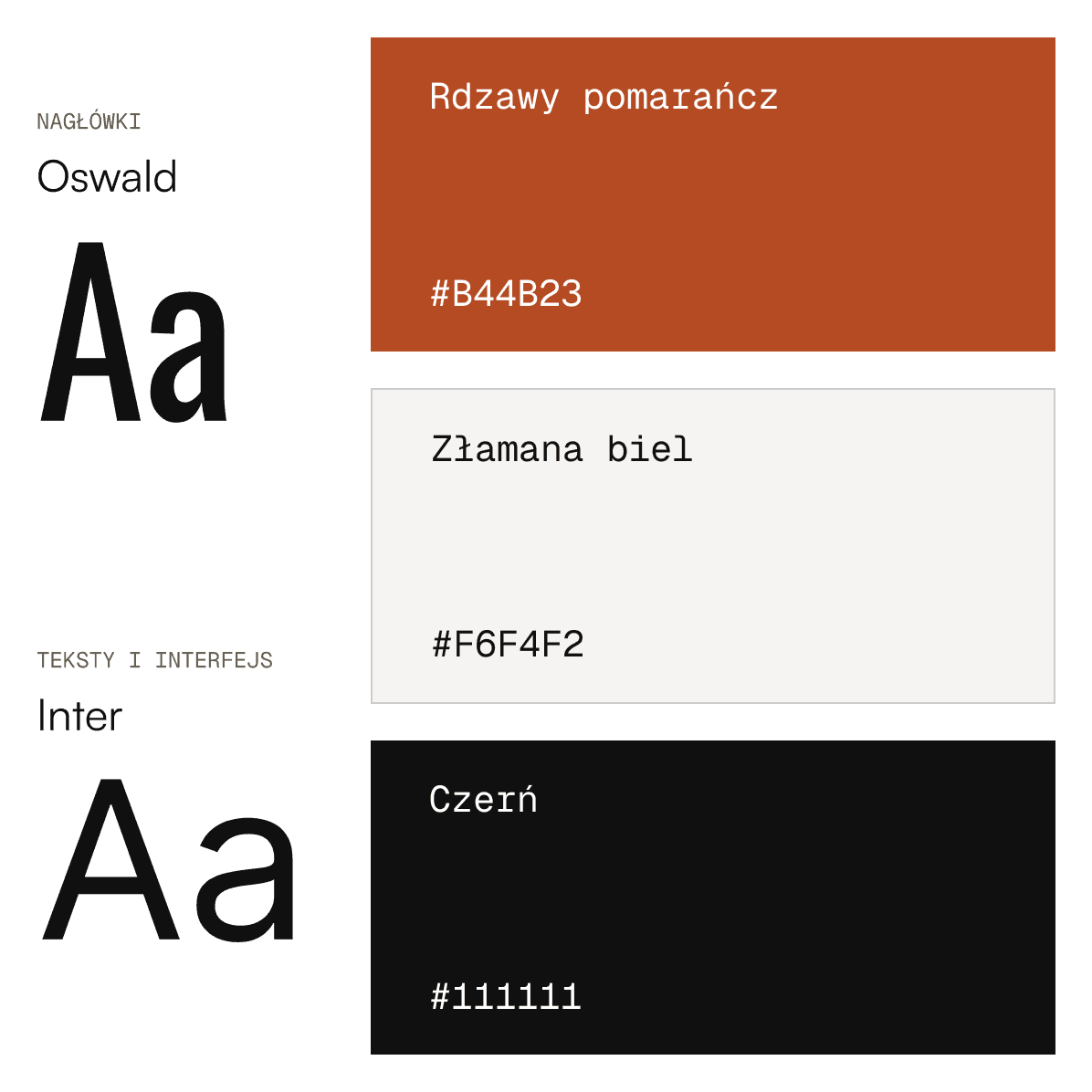
Distinctive, condensed headings give Miropoix character and set it apart from generic SaaS tools. I paired them with Inter for body text and interface elements to keep information readable. The palette is built around off-white and black, with an orange accent highlighting primary actions.
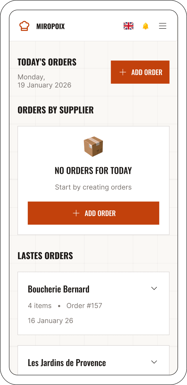
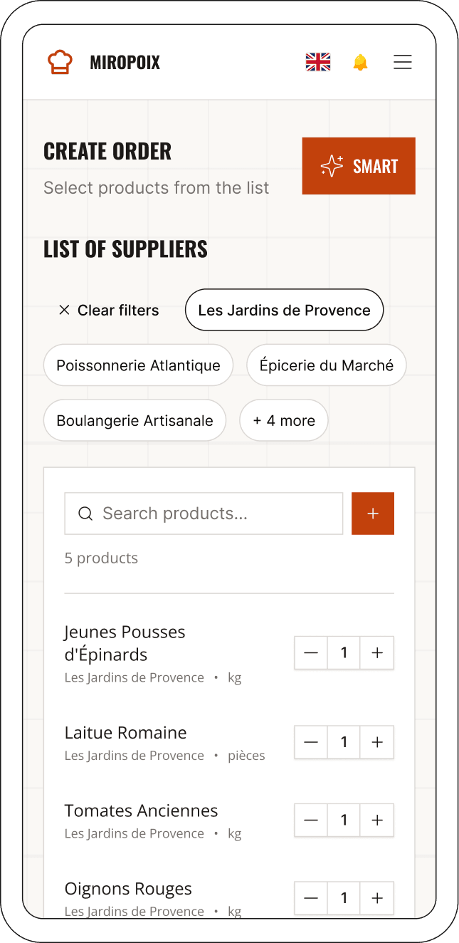
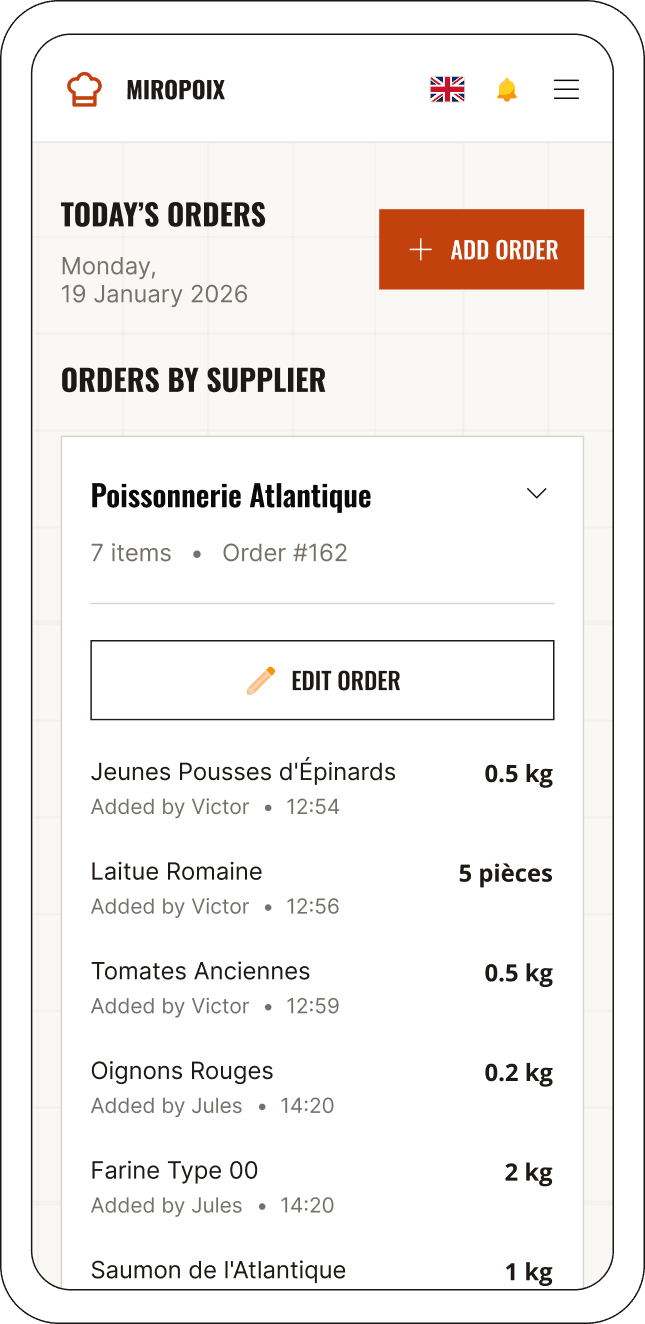
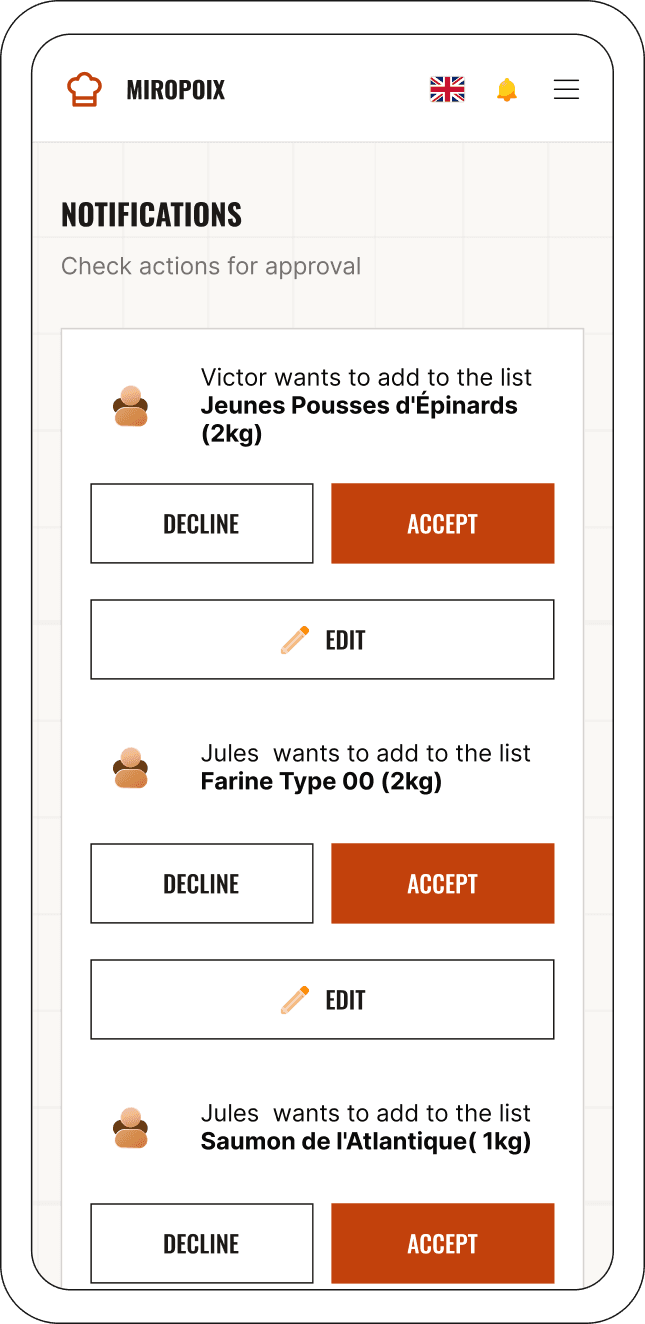
When refreshing the selected screens, I considered the conditions chefs work in. Larger buttons and click targets were intended to make quick interactions easier, including with dirty hands. The information hierarchy highlights orders, suppliers and actions requiring attention. The screens created for the website show different app states: an empty list, requests awaiting approval and orders grouped by supplier.
Development
I built the website with the help of AI tools, using React, Vite and Tailwind CSS. The tools helped me translate the design into code, while I remained responsible for visual decisions, reviewing the result and refining the implementation.
Results and reflections
The result is a working website that brings the new visual design together with interface previews and product animations. My role covered the entire process from visual design to implementation.
The project was an opportunity to combine UI, motion and AI-assisted development. Refining the design directly in the browser was especially valuable: I could assess responsiveness and animation behaviour alongside the static layout.