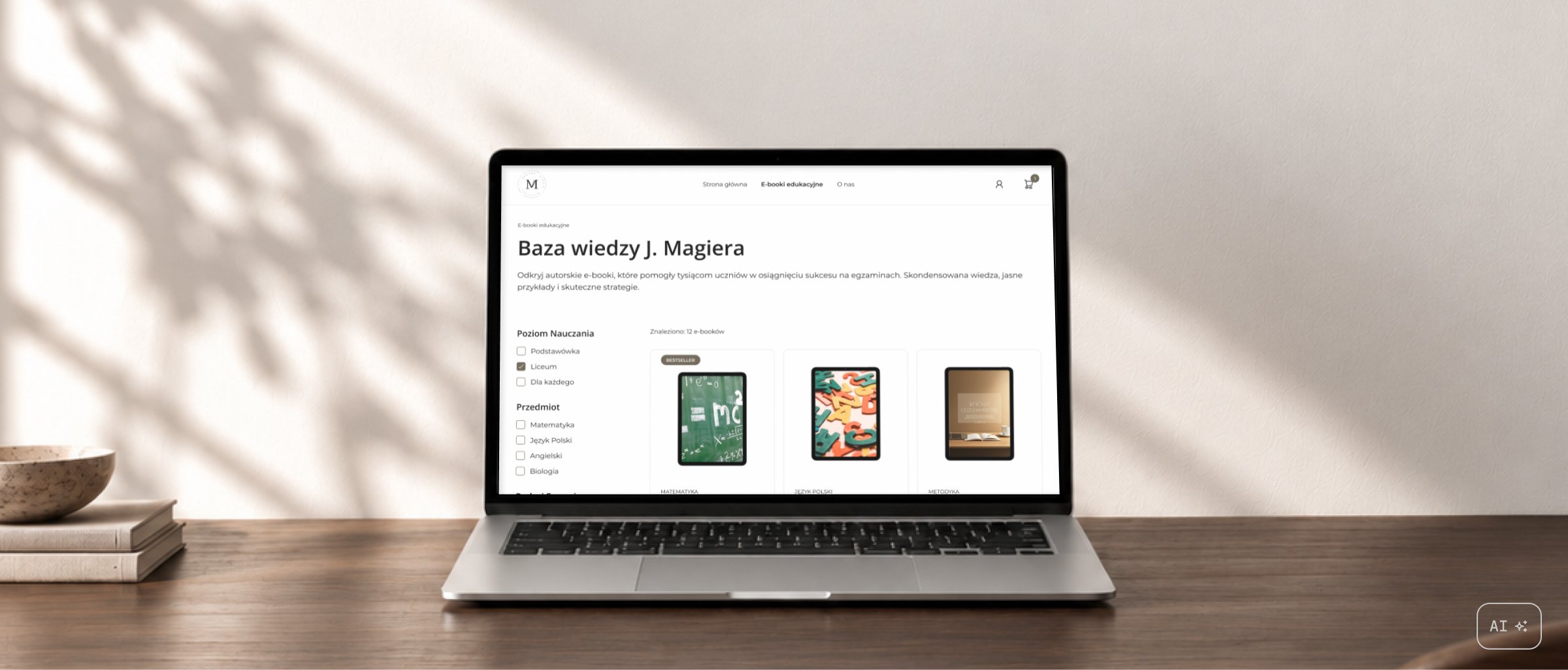
Akademia
e-commerce for educational e-books
- Role
- UX/UI designer
- Type
- Client project
- Tools

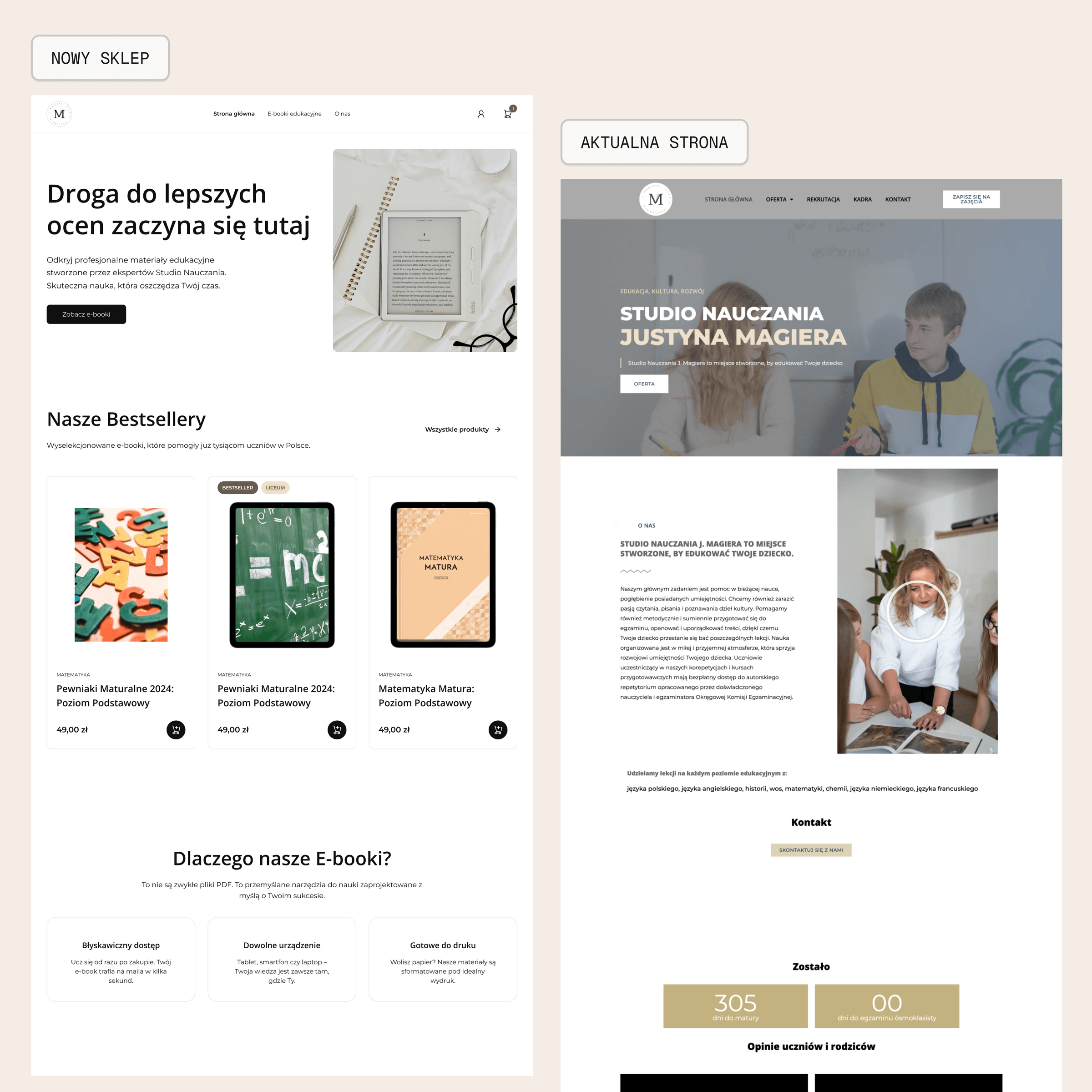
Akademia is an educational e-book store designed as a sub-application of the Studio Nauczania Justyna Magiera website. The aim was to bring the brand's character into a clearer, more modern interface suited to the needs of an online store.
- Problem
- Designing an online store that feels like a natural extension of an existing brand.
- Goal
- Design a consistent journey from finding an e-book to using the purchased materials, while refreshing the UI.
- Outcome
- A complete Figma design, ready for development.
Starting point
Studio Nauczania Justyna Magiera focuses on supporting students of different ages and preparing them for exams. The store needed to extend the brand naturally while helping users quickly understand each product and its value.
Even with a digital product like an e-book, users need to know what the material covers, what they will receive after purchase and where to find their files later. That's why the design covers both the purchase flow and the experience afterwards.
Process
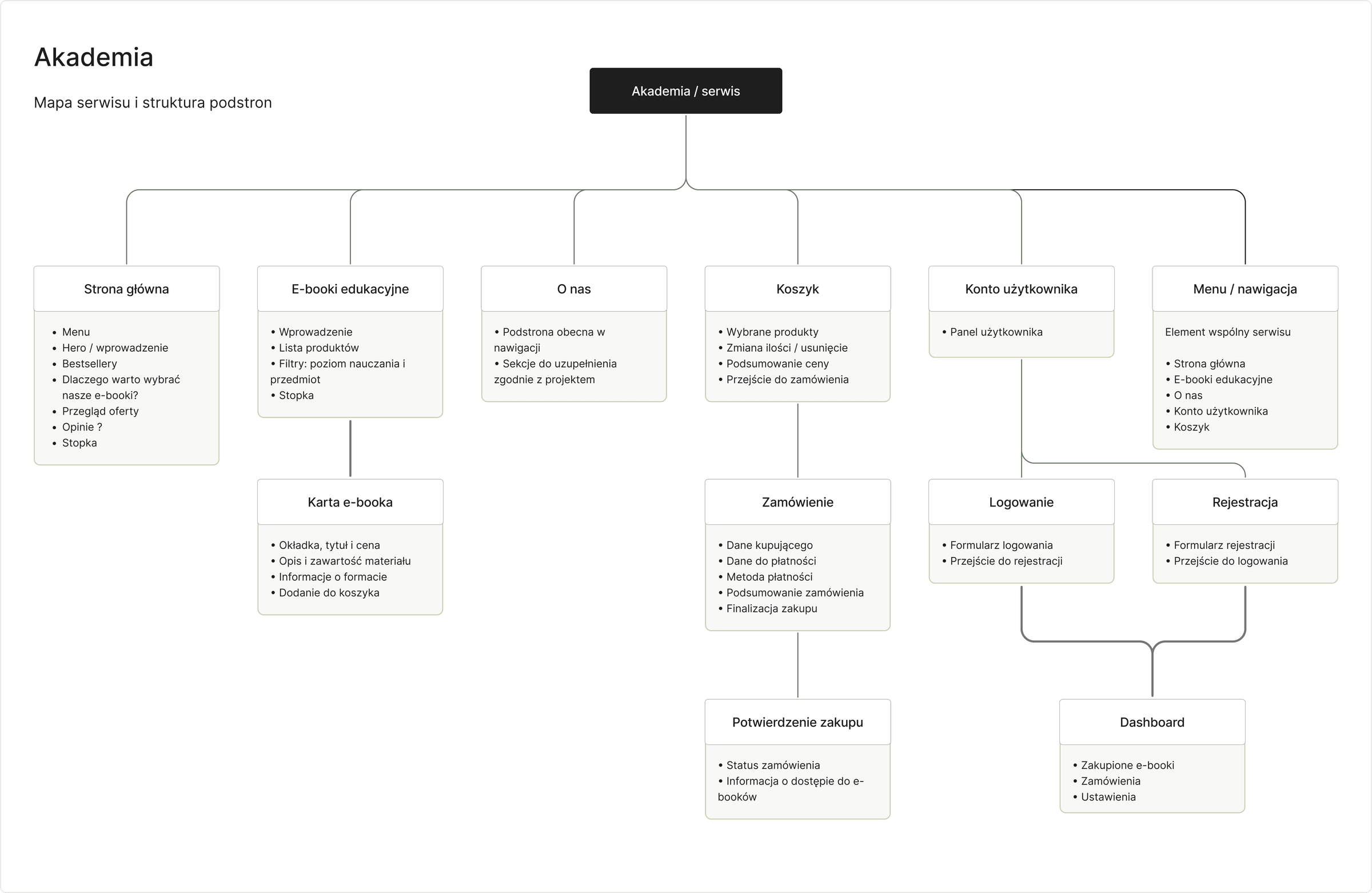
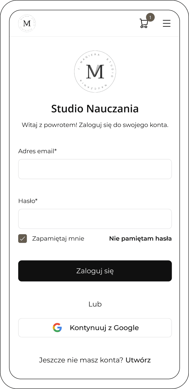
I started by mapping the full user journey. I designed the key e-commerce pages: home, product listing, product details, cart, sign-in and registration, billing details, purchase confirmation and the user account.
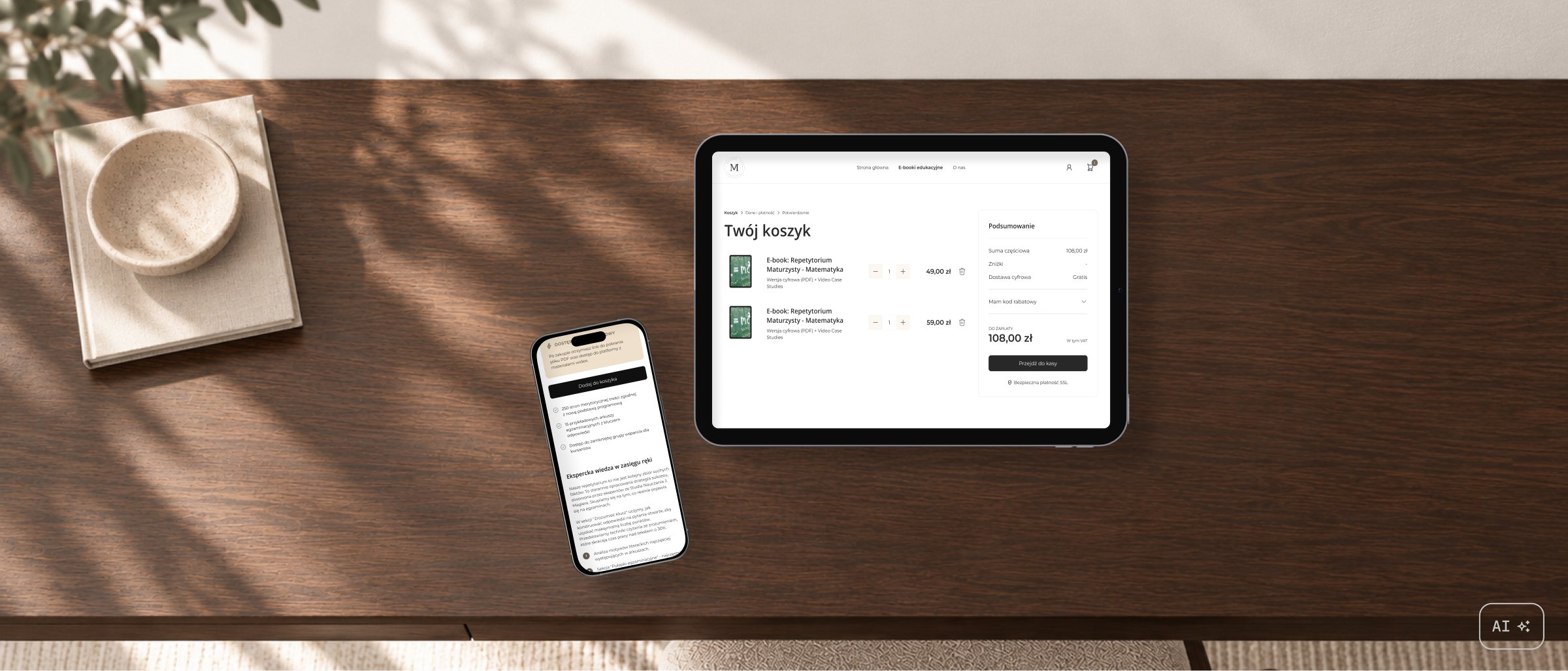
I designed desktop and mobile layouts in parallel so the whole site would be responsive and the designs could provide a practical foundation for development.
Design decisions
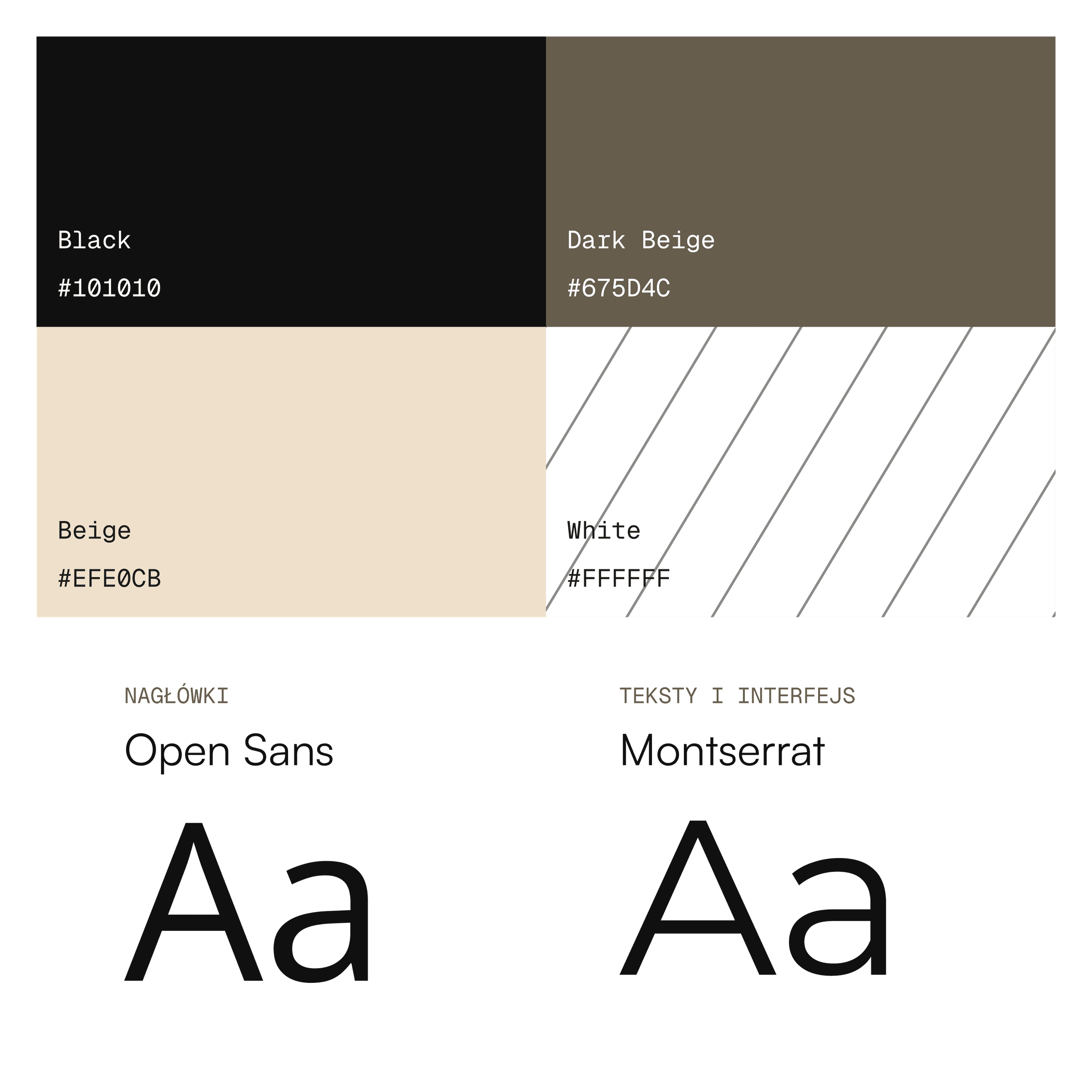
I kept the typography consistent with the main Studio Nauczania website so the store would remain a recognisable extension of the brand. Open Sans remained the heading typeface, while I used Montserrat for body text and interface elements.
I extended the palette with additional shades for backgrounds, text and primary actions. This preserved the brand colours while allowing combinations that take WCAG contrast requirements into account.
From selection to purchase
The product page needed to help users decide whether the material suited their needs. I organised information about the content and its purpose, keeping the price and add-to-cart action prominent. The rest of the checkout follows familiar e-commerce patterns, with a clear order summary and next steps.
The video could not be played. Open MP4 file
The video could not be played. Open MP4 file
Access after purchase
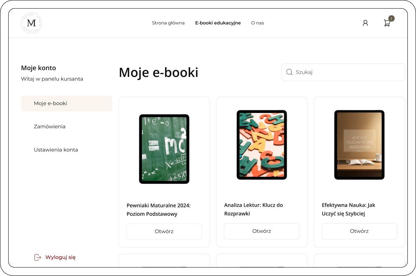
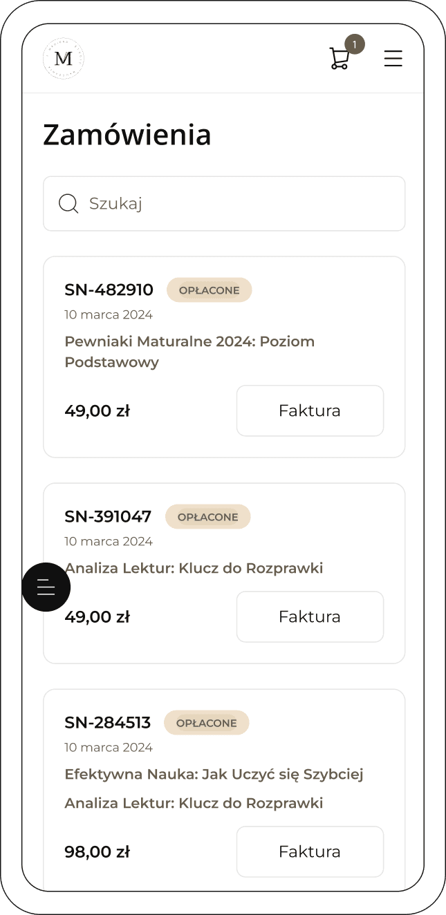
The user journey doesn't end at payment. I designed a library of purchased e-books and an order history so the materials would have a permanent, easy-to-find home. Desktop and mobile layouts were developed in parallel, with the same functionality and a hierarchy adapted to each screen size.
Results and reflections
I designed the complete e-book shopping journey, from browsing and choosing materials to payment and access to purchased files. The desktop and mobile layouts combine the character of Studio Nauczania with an organised store interface.
The main challenge was to keep the brand recognisable while adapting it to e-commerce. Visual consistency had to work alongside a clear offering, a predictable checkout and easy access to materials afterwards.
The store is live. The designs in this case study show my UX/UI work; some solutions differ in the production version.