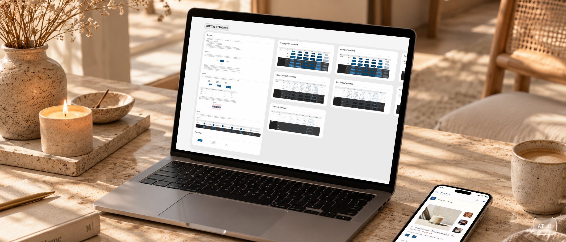
AuraPura
From brand foundations to a design system
- Role
- UX/UI designer
- Type
- Concept project, Design System Intro course
- Tools

AuraPura is a concept design system for e-commerce, created as part of the Design System Intro course. I translated the brand brief and assets into tokens, components and responsive mobile, tablet and desktop layouts.
- Problem
- Translating brand assets into consistent design principles that work across components and screen sizes.
- Goal
- Build the foundations of a system that lets the interface grow without redefining the same solutions from scratch.
- Outcome
- A library built on core and alias tokens, Figma Variables and components used in layouts for three screen sizes.
Process
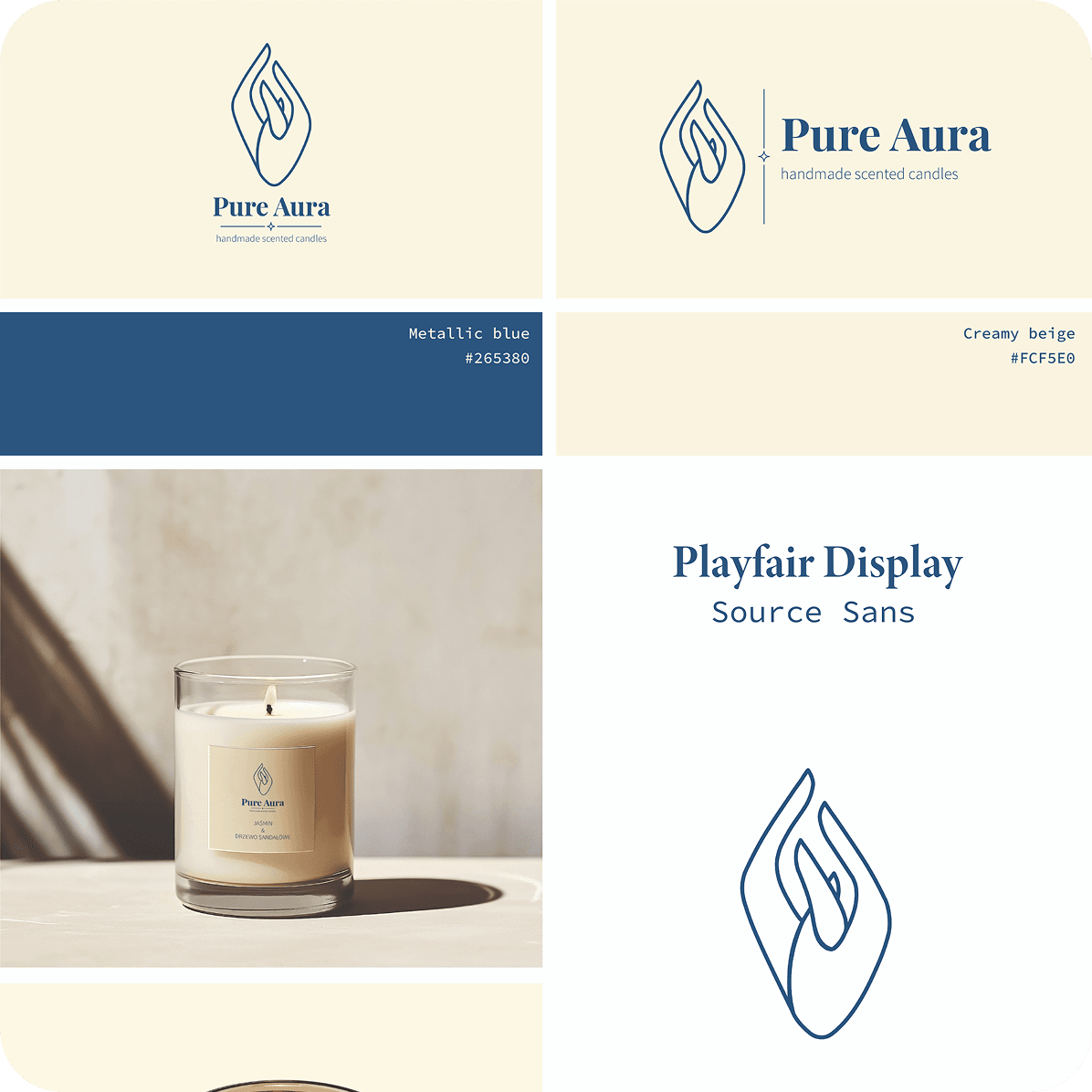
I started by analysing the brand brief and assets to define the palette, typography and visual direction. I then organised these decisions into a token structure that became the foundation for the components.
I worked from foundations to application: first shared values and their roles, then components, and finally responsive layouts. This helped me trace how system-level decisions affect the finished interface.
System foundations
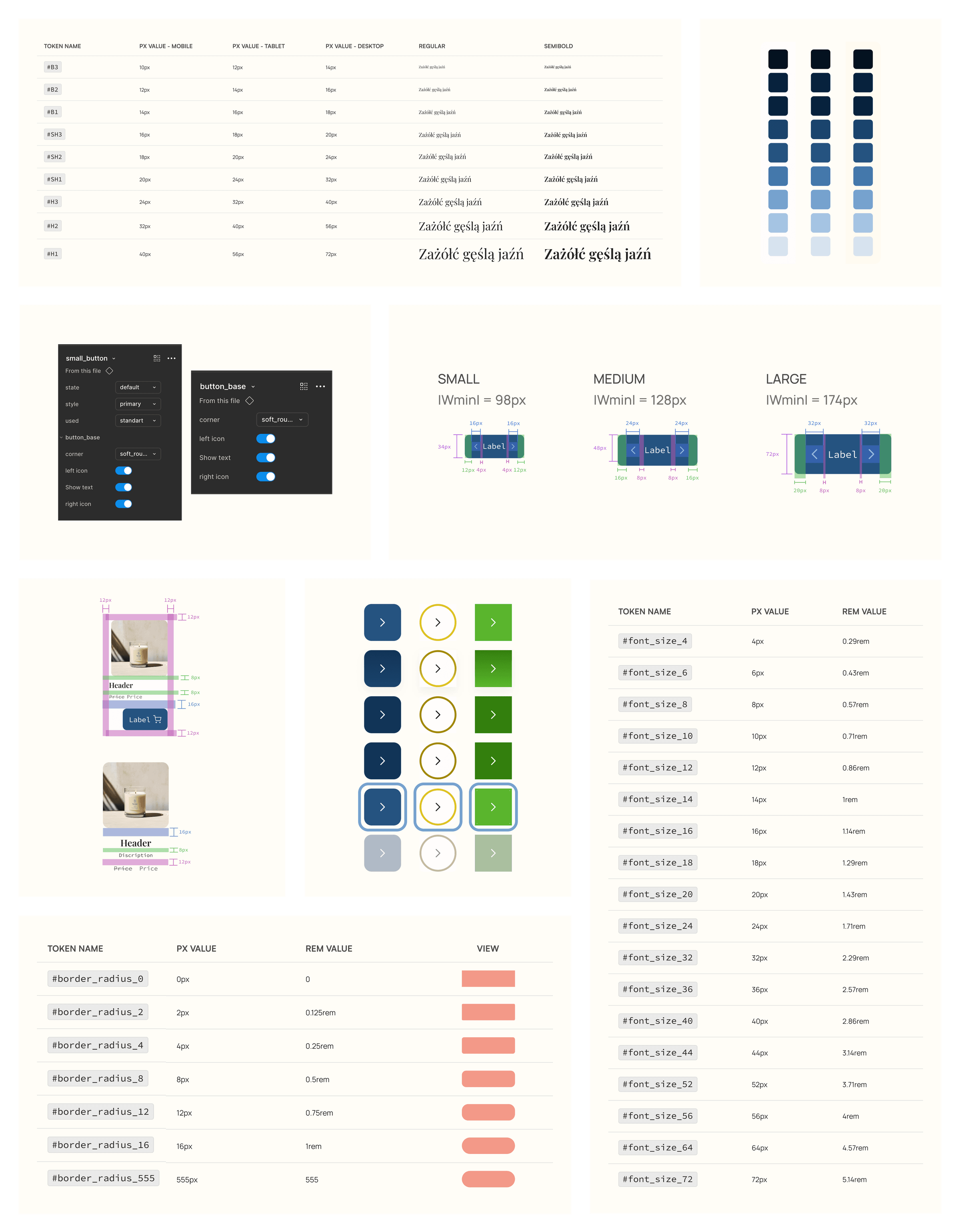
I translated the brand palette and typography into values used throughout the library. I separated them into core tokens holding base values and aliases describing how those values are used.
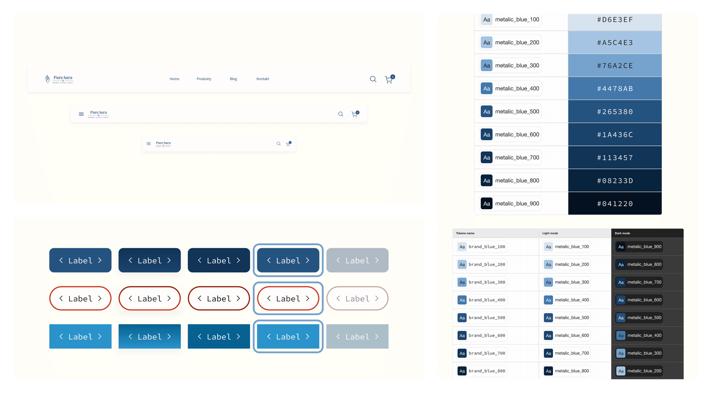
This separates a specific value from its role in the interface. Each component uses an assigned role, so changes can be made at token level instead of updating every element individually.
Components and responsiveness
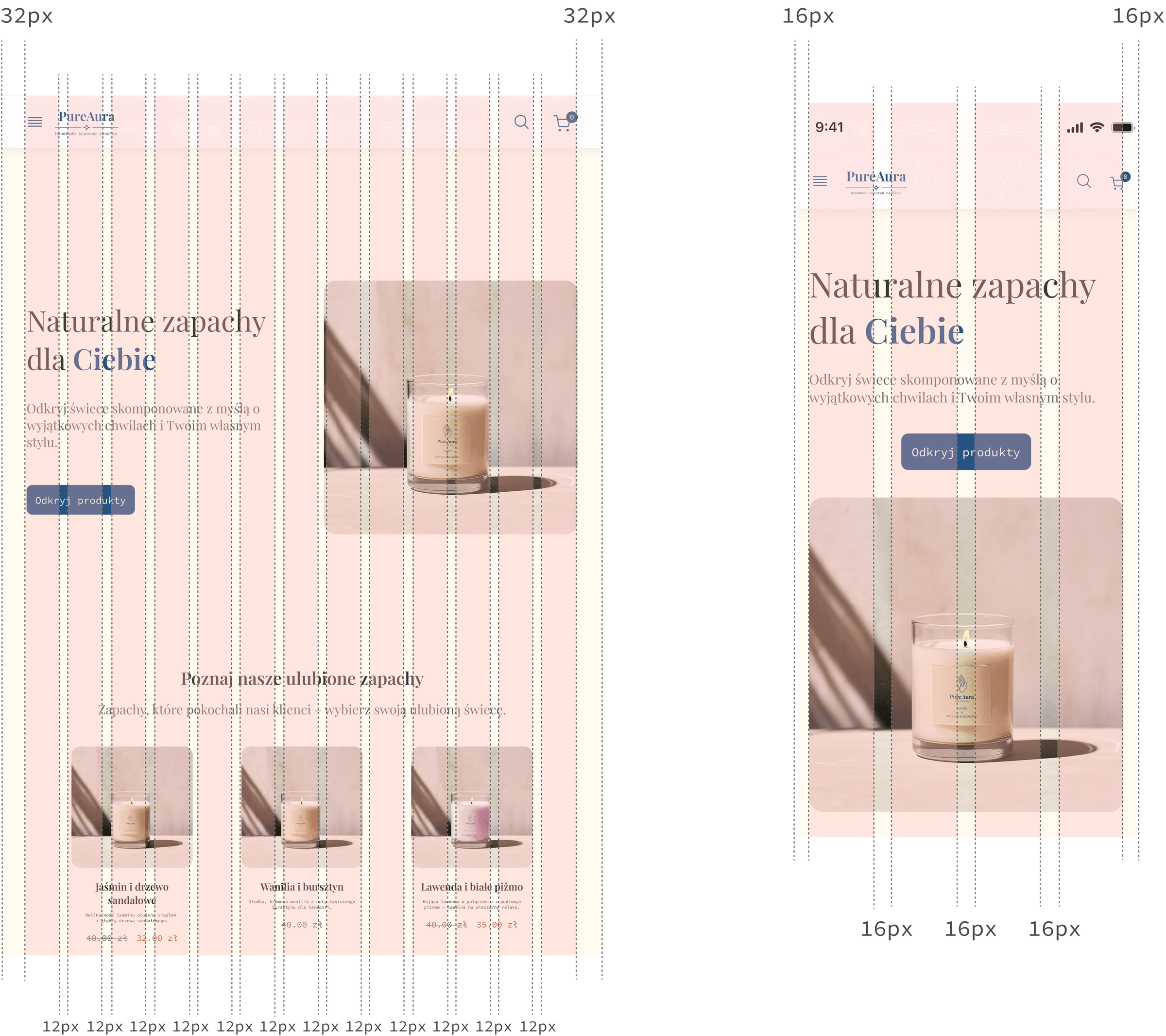
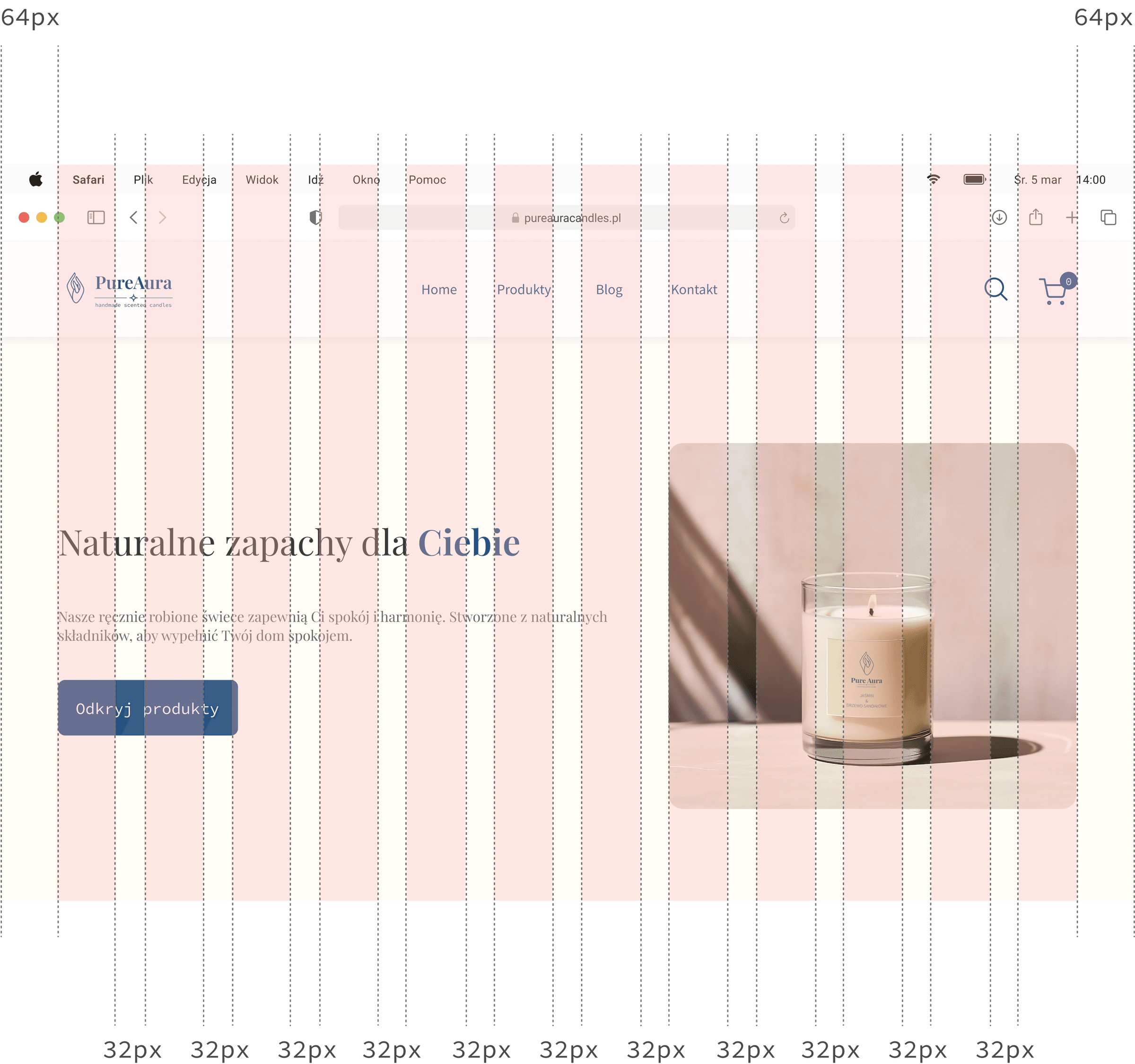
I built components using shared tokens and variables. I used Figma Variables for both colour variations and values that change across breakpoints. This let me adapt elements to mobile, tablet and desktop without multiplying variants for every width.
I then applied the library to e-commerce layouts. These screens show how shared principles preserve visual consistency as the available space and content arrangement change.
Results and reflections
The result is a design system foundation covering tokens, variables, components and responsive layouts. My main takeaway was that system consistency starts before component design. Token structure, naming and assigned roles shape every screen that follows.
To develop the project further, I would focus on usage documentation, component accessibility, extending the library around real needs and defining how changes are introduced. The next stage would also involve connecting tokens to code and testing the system in a team setting.