Mova
A clear language-learning journey
- Role
- UX/UI designer
- Type
- Concept based on a client project
- Tools
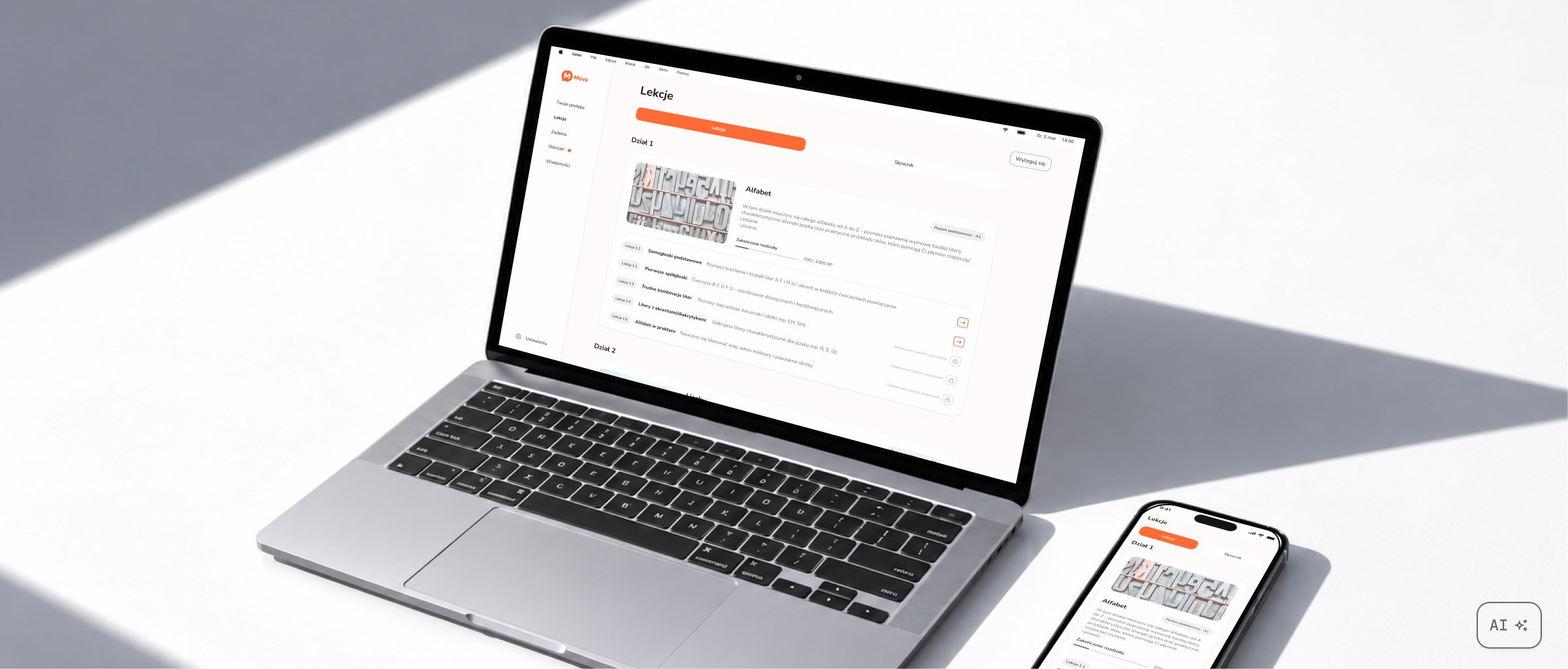
Mova is a language-learning app concept based on a client project. I focused on lesson structure, progress feedback and a consistent mobile and web interface that supports learning without competing with the material.
- Problem
- Finding a balance between a motivating interface and a calm learning space, without excessive gamification or overwhelming amounts of content.
- Goal
- Design an app that guides learners through the material step by step and clearly shows their progress.
- Outcome
- Mobile and web designs with structured lessons, feedback and a UI kit ready to support additional screens.
Research
I compared Duolingo, Babbel and Busuu, looking at habit building, progress feedback and how they guide learners through the material. This helped define Mova's direction: short learning stages, a clear place within the course structure and fewer distractions from the content.
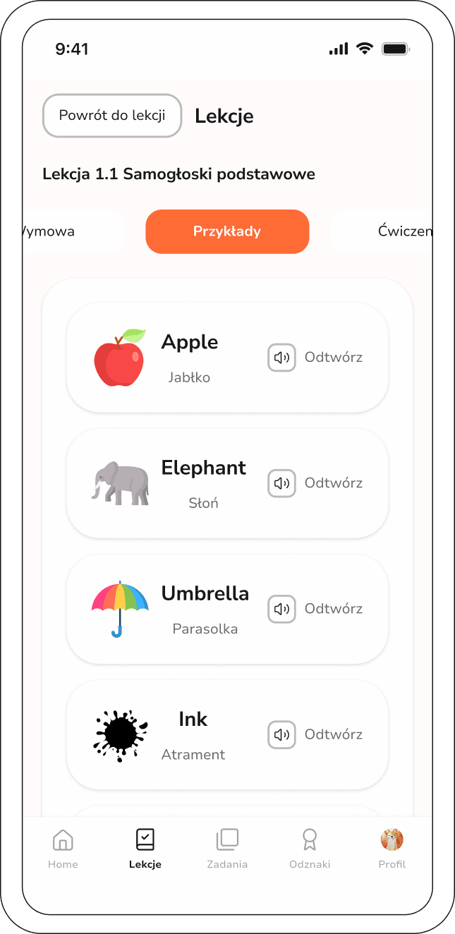
I translated these principles into the app architecture. Lessons are grouped into topic-based modules, each following a sequence of material, exercises and a summary. A dictionary and flashcards add independent revision, with a particular focus on quick mobile sessions.
Solution and key decisions
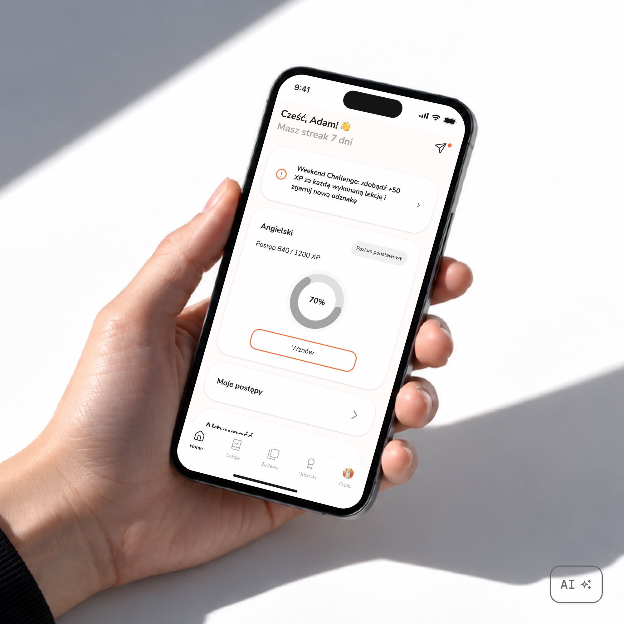
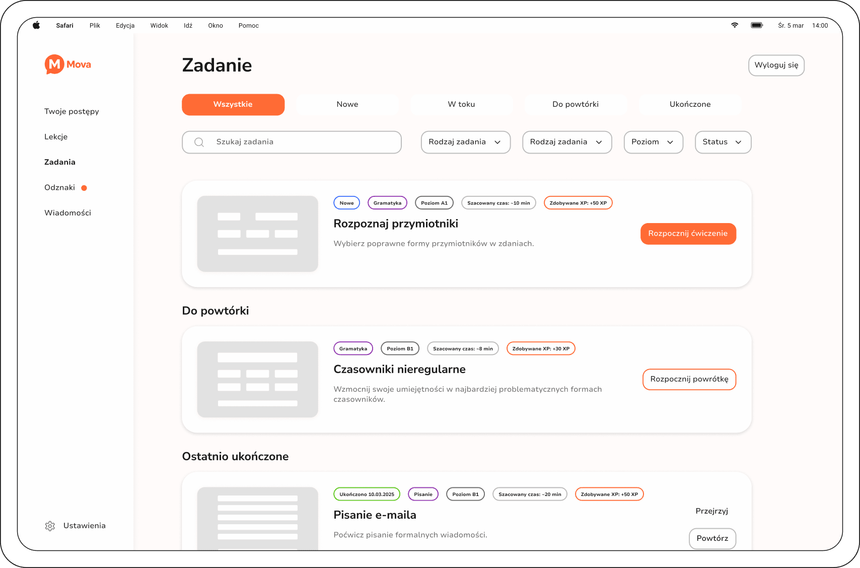
The current module is the focus of the screen, with progress indicators playing a supporting role. Learners should see where they are in the course and what they can do next, without dominant leaderboards or extra distractions. I used the orange brand colour mainly for actions, navigation and progress indicators.
I paid close attention to feedback in exercises and summaries. The messages show what went well, where a mistake occurred and what to improve. The dictionary and flashcards let learners revisit selected vocabulary outside the main lesson flow.
The video could not be played. Open MP4 file
I treated mobile and web as two learning contexts. The mobile version is designed for short sessions and quick revision, while the web version supports longer study. Both share the same logic and visual language, with layouts adapted to the available space.
Design
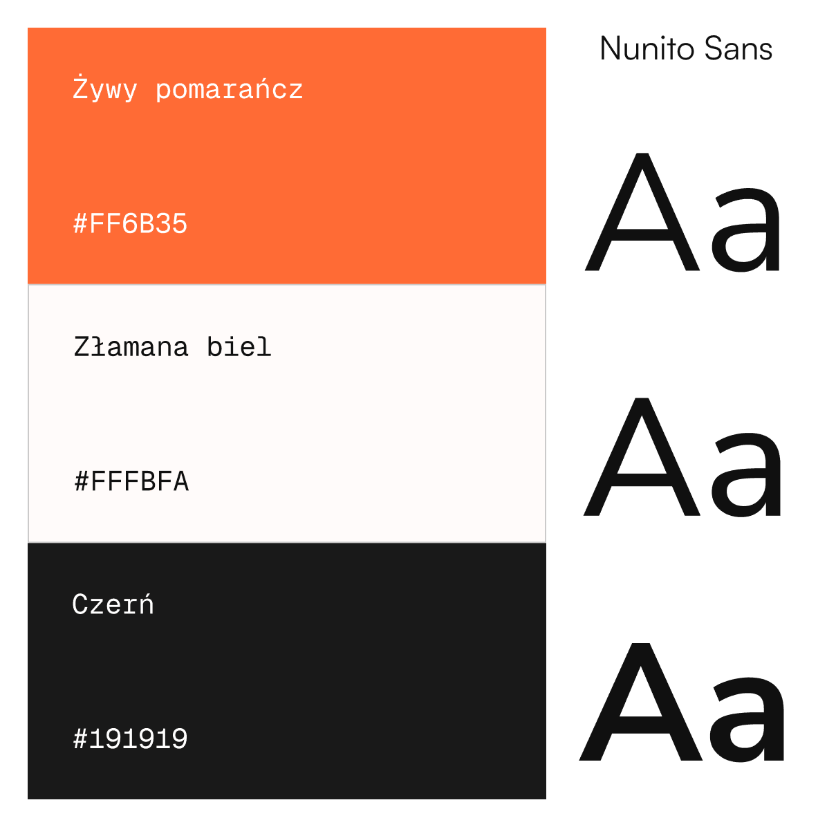
Mova's visual design uses light surfaces, neutral shades and an orange accent to highlight primary actions, navigation and learning progress. Nunito Sans gives the app a friendly feel, while its different weights establish a content hierarchy without excessive decoration.
I turned these principles into a UI kit covering lesson components, tags and interaction states. Typography styles and Figma Variables organise shared values, making it easier to keep mobile and web consistent and develop new screens.
Results and reflections
The result is an app concept that combines a structured course journey with independent revision. The project let me explore information hierarchy in an educational product and the differences between designing for a phone and a computer.
The next step would be to test the prototype with language learners. I would check whether the lesson structure, progress indicators and feedback are clear. I would also develop onboarding that introduces the app's features gradually.